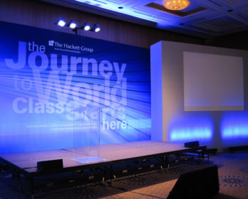
Things to Consider when Designing an Event Backdrop
As you begin your design, remember to keep your logo and letters in a clear field. Although it looks great on your screen that little star by the letter I, now blown up to full-scale looks out of place or can seem like a print error when viewed in the room.
Remember the Viewing Obstacles – Stage, Podiums and Presenters
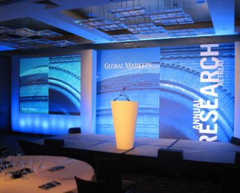
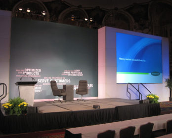
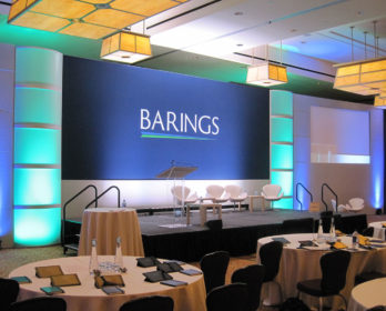
If you’re designing the General Session Room graphic, it will be sitting behind the stage. Most stages are 2’ tall and will obstruct the lower part of your design. While other designs may be elevated impacting the ideal logo and meeting theme placement. Check with your producer to confirm the stage height, check the elevation of the graphic, and inquire about podium and furniture placement.
IMAG – Visualize the Camera Shot
If the presenters are on camera for the event, please discuss the camera angle and shot with the producer. It’s important to avoid the appearance of letters growing out of presenters’ heads or situations where words can be partially blocked by presenters creating new words that are magnified on large projection screens.
Front Projection on a Custom Print
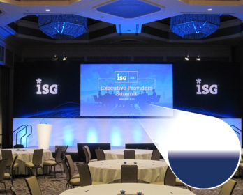
If your planning on incorporating a projection area into your design we suggest using a 3/4” soft gradient to transition from your design into the white projection area. The gradient will allow the Audio Visual team to define the projection area with light creating clean, crisp lines.


